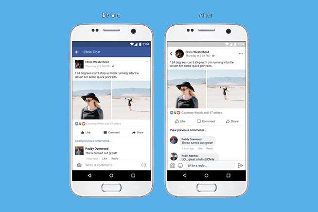
In the coming weeks, the social netwok will release updates that will optimize the app's design, improving the visibility of text and colors
More news coming for Facebook users. After announcing Watch and introducing Trending News, the social network is ready to revamp the interface of its mobile application, launching graphic changes that will significantly improve the readability of the News Feed.
In a recently published blogpost, Mark Zuckerberg's company communicates the changes, which will be visible to users with updates released in the coming weeks. In particular, the new design will be optimized to make comments more prominent (they will be surrounded by a gray background). I messaggi saranno, inoltre, più semplici da individuare e per gli iscritti sarà più facile rispondere. Le novità grafiche apporteranno delle variazioni anche alle icone. Facebook cambierà quelle dei “Mi Piace”, “Commenta” e “Condividi”, che saranno più grandi e con una forma diversa, dove il classico colore scuro di riempimento sarà sostituito dal bianco.
Migliorata anche la visibilità dei link
La leggibilità del News Feed sarà migliorata anche per quanto riguarda le anteprime dei link. Anche in questo caso, l’interfaccia sarà ingrandita e il contrasto ottimizzato. Moreover, it will be even easier to visualize the website of the links: compared to what happens now, in fact, the web address is placed not at the bottom of the title, but above.
News Feed more navigable

How Facebook will change
Another important novelty, which will be introduced in the new graphic look, concerns the profile image, which in the news section, as well as in the comments, will pass from square to circular. In addition to readability, the updates will also optimize the navigation of the News Feed. Returning to the news section after opening an article, for example, will be faster thanks to a larger button.
